灑金流光 Golden Hours│峻-空間設計
日期:2022-11-16
灑金流光 Golden Hours
本案為獨棟街屋一樓改造而成的預約制牙醫診所,室內面積約150平方米。
This project is a dentistry appointment system renovated from the ground floor of an independent street house, with an indoor area of about 150 square meters.
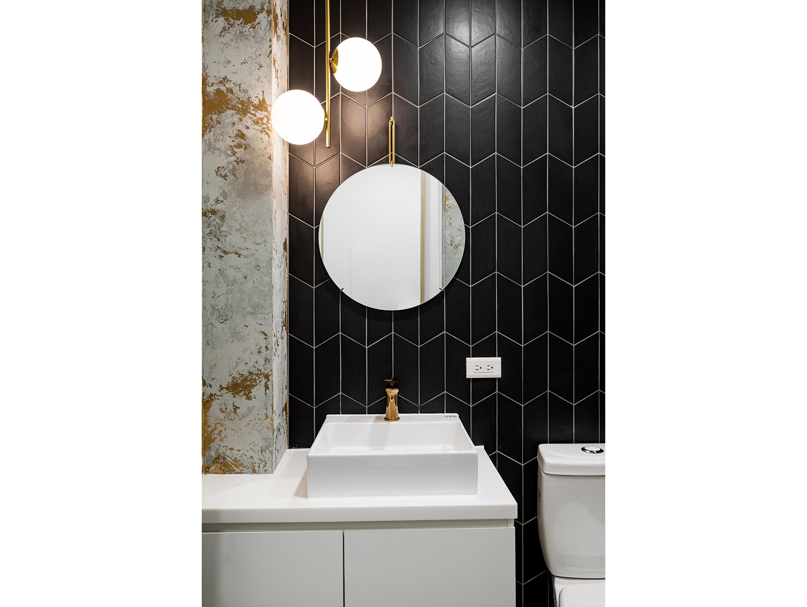
由於屋形狹長且使用空間僅限一樓,為了爭取最佳坪效,刻意繞開中央段暫時閒置梯間,並搭配地材切割、跳色變化和局部玻璃隔間所形塑的迂迴動線,成為串流全案的靈魂發想。其次是全室基於約診制而衍生的現代輕奢風格;色調上選用柔白、玫瑰金、淺木色、焦點式靛藍色塊等,與錯落漸進的光影變化相互映襯,營造高格調且私密、放鬆的場域氛圍。
Due to the long and narrow house form, as well as the available usage space restricted to the ground floor, the unused stairway in the center is deliberately avoided together with the use of flooring segmentation, color variations and partial glass partitions to create the circuitous circulation in order to obtain the optimized sales per unit area, which has become the inspiration streaming the entire project. Secondly is the modern light luxurious style of the entire space derived from the appointment system; colors such as soft white, rose gold, light wood and focused azure color block are selected to mutually complement the variations of the lights and shadows, creating a high-end, private and relaxed atmosphere for the venue.
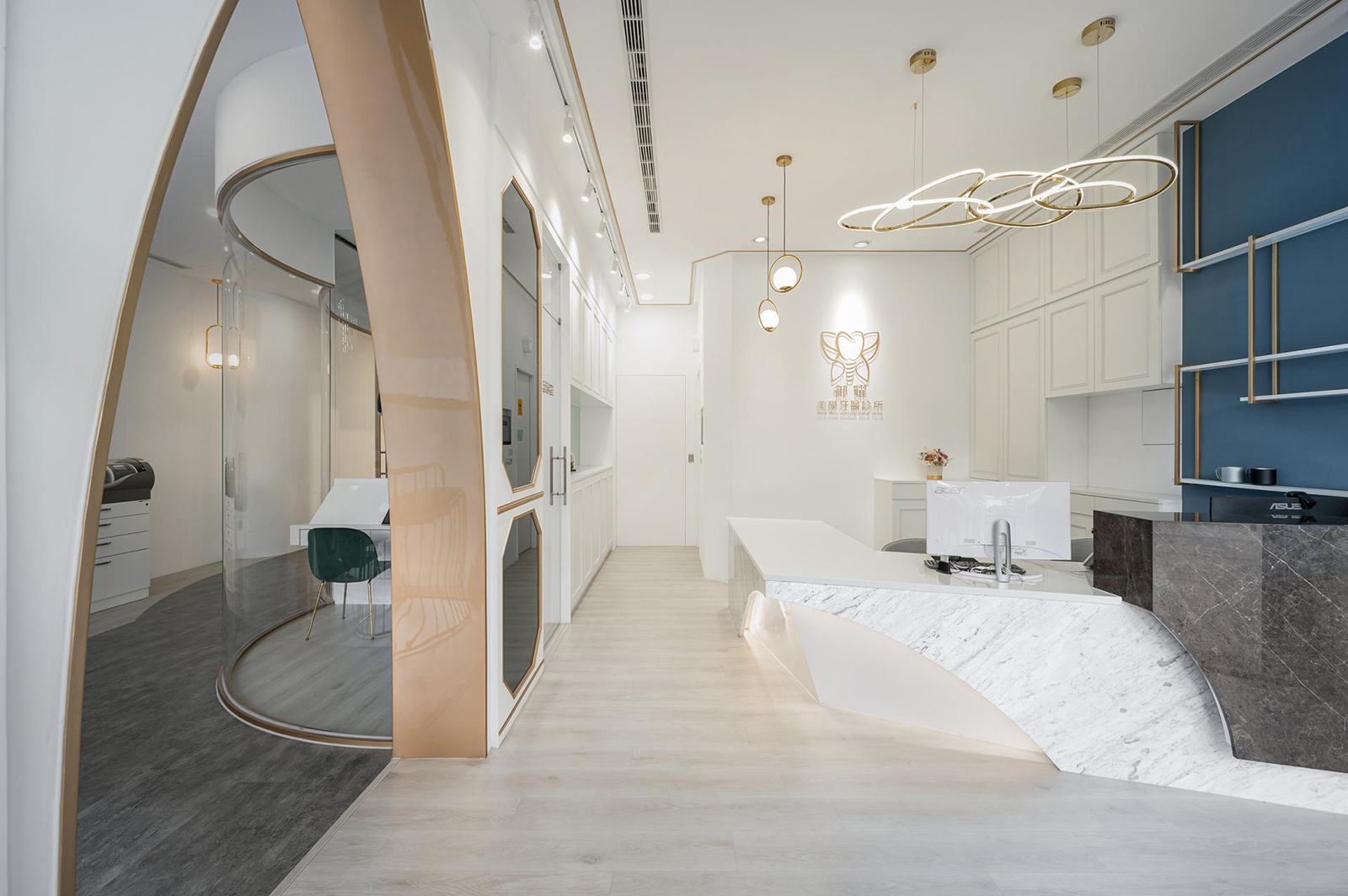
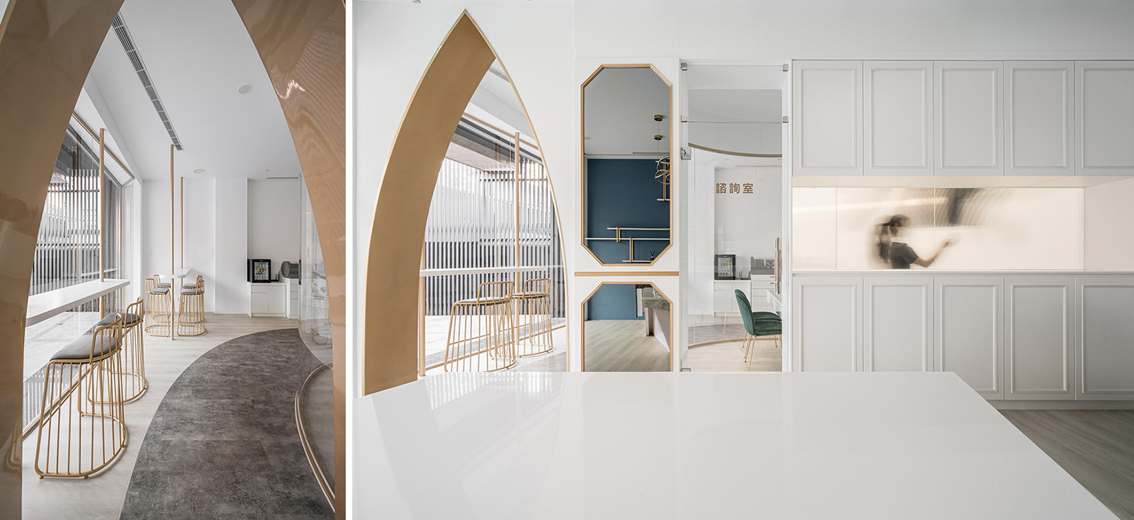
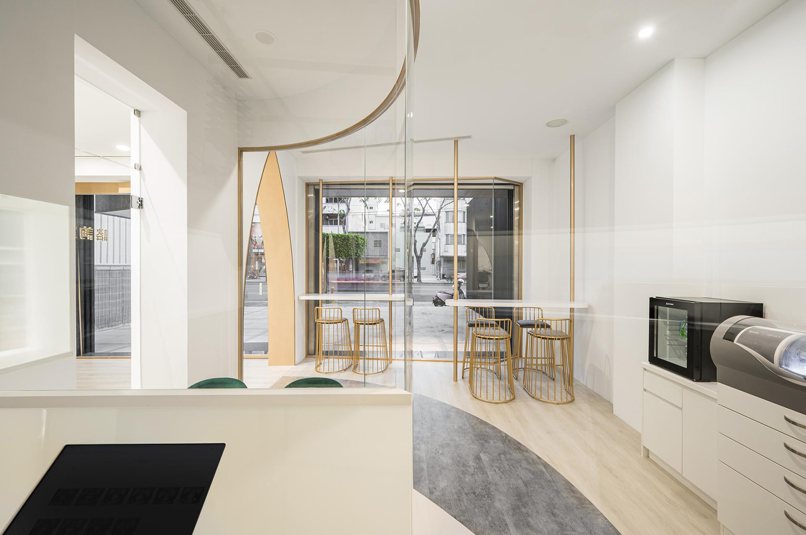
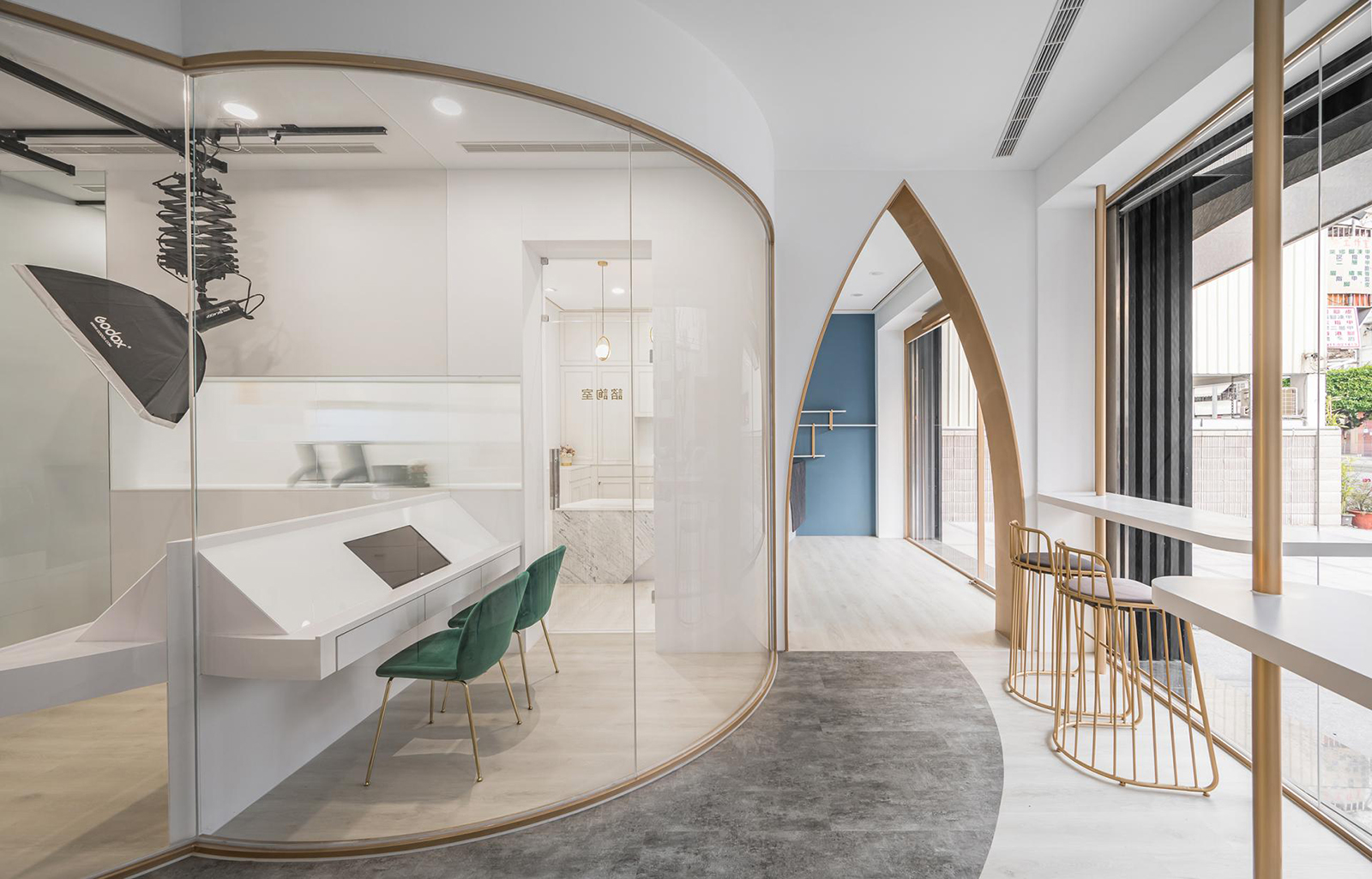
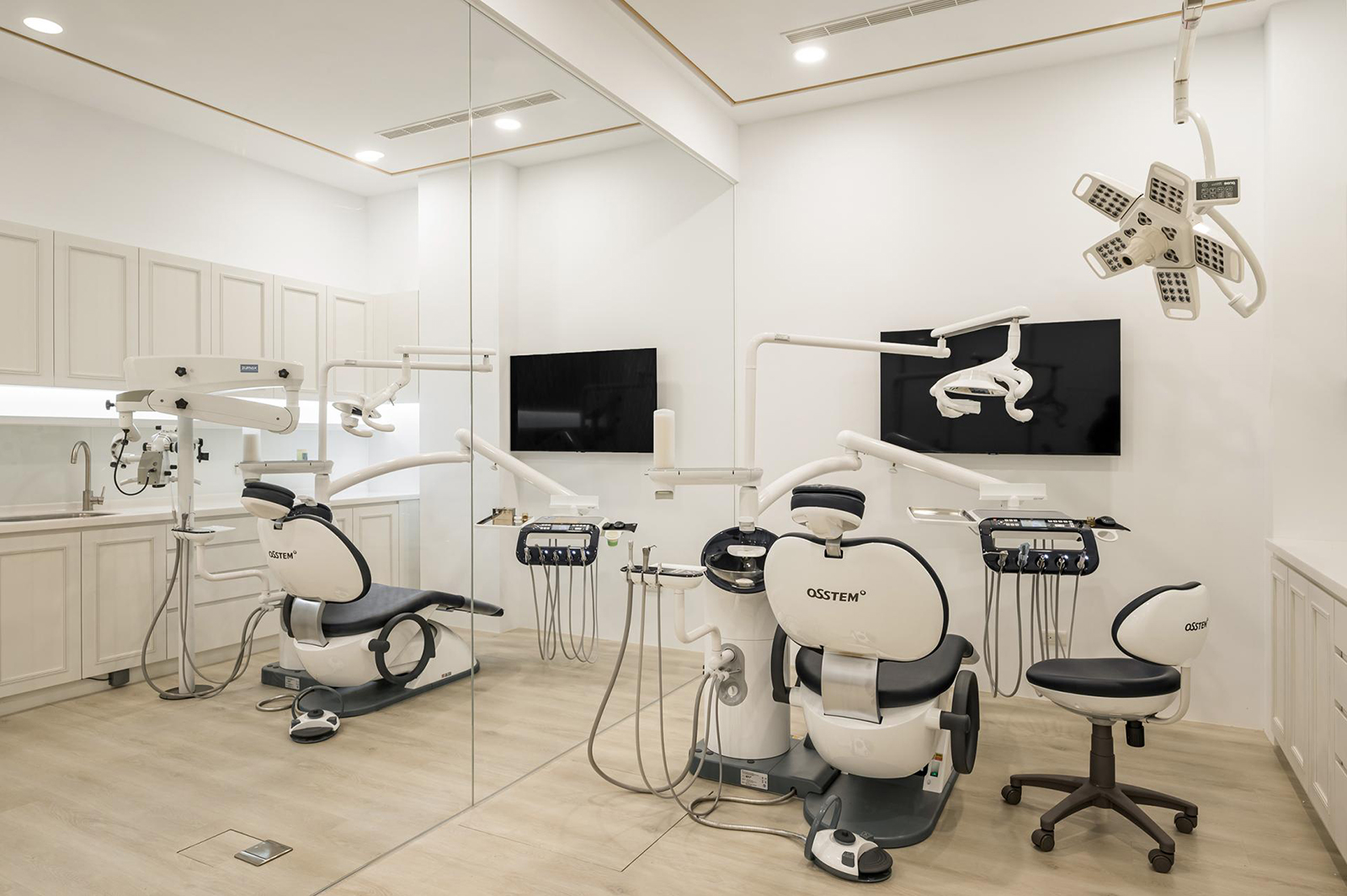
高挑正立面外觀採立體線構包覆設計,其上點綴不規則排序的垂直燈帶與霓虹店招,在夜裡格外醒目。入口左側刻意斜切的落地窗,巧妙對應櫃檯斜度,加上室內臨窗宛如咖啡座的等候區,帶出以退為進的聚焦效果。接待櫃檯區則以柔白打底,穿插金系線條、燈藝與靛藍色塊,層次堆疊的異型櫃檯尤其展現精練立體雕塑之美。優美華貴的尖弧型門拱為全案動線起點,順著事前需多次現場放樣的地坪深淺色塊導引,逐一可達不同機能單元、診間,沿途包括美白室、部分診間,另在清透玻璃隔牆上作弧度切割與邊框包金處理,巧妙化解廊間轉折的壓迫外,同時平添互不干擾且有趣的空間體驗。
The external looks of the high facet have adopted the 3D linear structure wrapping design decorated with irregularly arranged vertical light belts and neon signboard, which appear exceptionally eye-catching at night. The deliberately slanted French window on the left after entering the entrance ingeniously corresponds to the slanted angle of the reception counter, creating the focusing effect of retreating to take a step forward together with the waiting area resembling coffee seats by the window. The reception counter has adopted the soft white color for the foundation, decorated with golden lines, artistic light fixtures and azure color block, while the layers of irregularly stacked counter especially demonstrated the sophisticated beauty of the 3D sculpture. The elegant and gorgeous pointed arch is the start point to the circulation of the entire project, where one can arrive at the different functional units and clinics by following the dark and pale color blocks of the flooring, which was trialed out several times during the design process, including the whitening room and some of the clinics; moreover, transparent glass partitions are cut in arched angle and finished with golden frame, ingeniously eliminating the oppression of the corridor transition, as well as adding interesting uninterrupted spatial experience.

完整室內設計作品
- 資料來源:
- DECO TV編輯部
- 照片來源:
- 峻空間設計室內裝修有限公司