輯影 Microcosm|朋沛設計
日期:2022-07-12
輯影
Microcosm
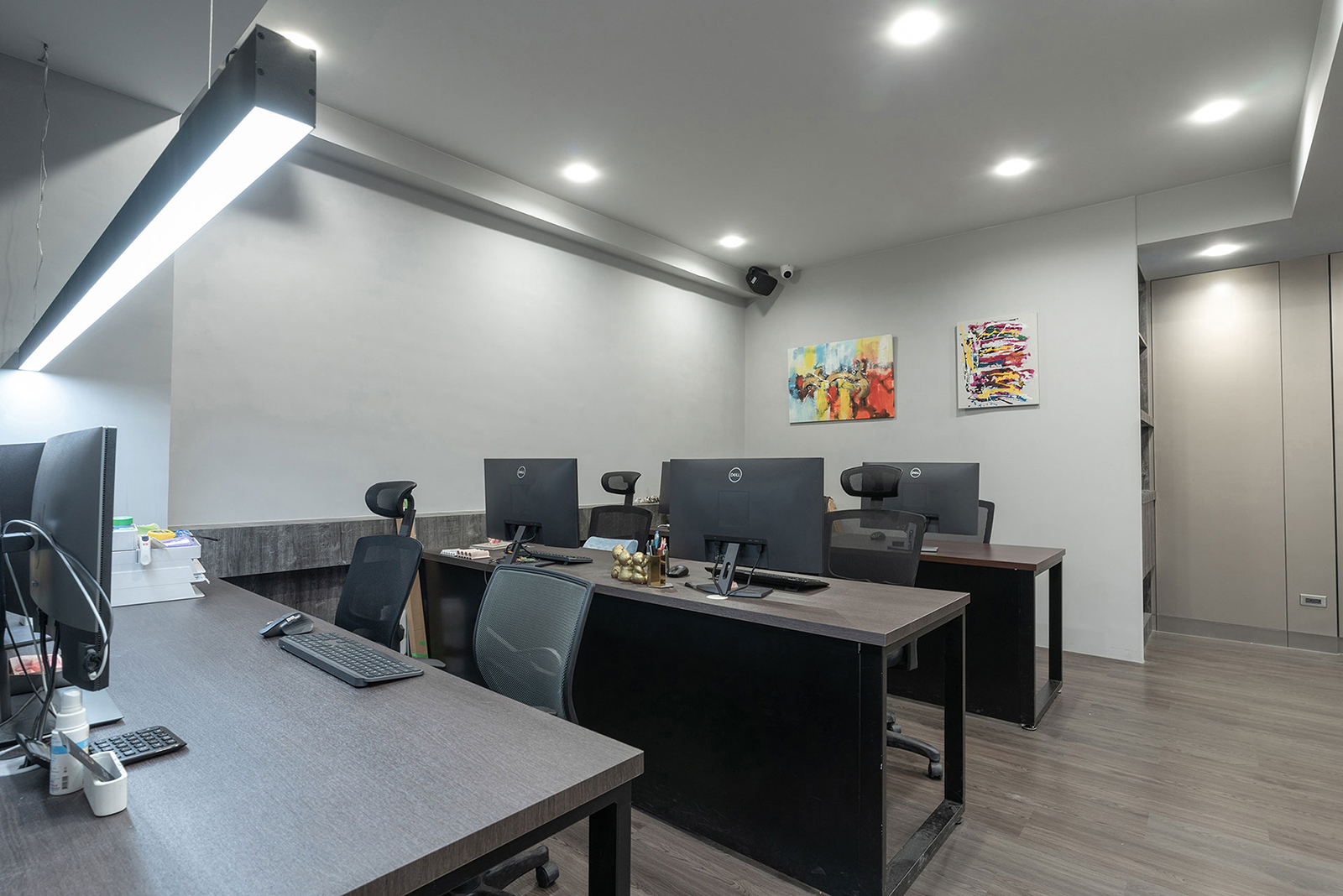
本案由高齡華廈一樓改造,全室面積約80餘平方米,規劃後作為設計工作室使用。工程實作重點包括外牆滲漏水修復、窗門管線更新和格局重置,一方面強化結構體質;延長裝潢壽命。規劃主軸則是依需求量身配置實用機能單元,如玄關、接待區、工作區、會議室、廁間等,並在空間淨高僅二米六前提下,施以輕量平釘和嵌燈照明,避免天花板因造型堆疊反生壓迫,積極爭取超越既有坪數的流動性與通透感。
This project is a renovation of the first floor space of an old building with a total area of about 80sqm, which is intended to be used as a design studio. The core focus of the project is to repair the water leakage on the exterior wall, revamp the windows and doors, and reset the layout in order to strengthen the structure and extend the life of the décor. The main objective of the planning is to configure practical functional units in line with actual needs, such as entryway foyer, reception area, work area, conference room, and toilet, etc. Under the condition that the net height of the space is only 2.6 meters, flat ceilings and recessed lighting are applied to avoid the sense of constriction of the ceiling due to the stacking of shapes, and to strive for a sense of flow and transparency beyond the actual spatial restrictions.
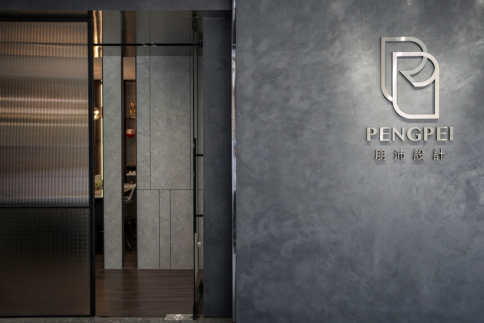
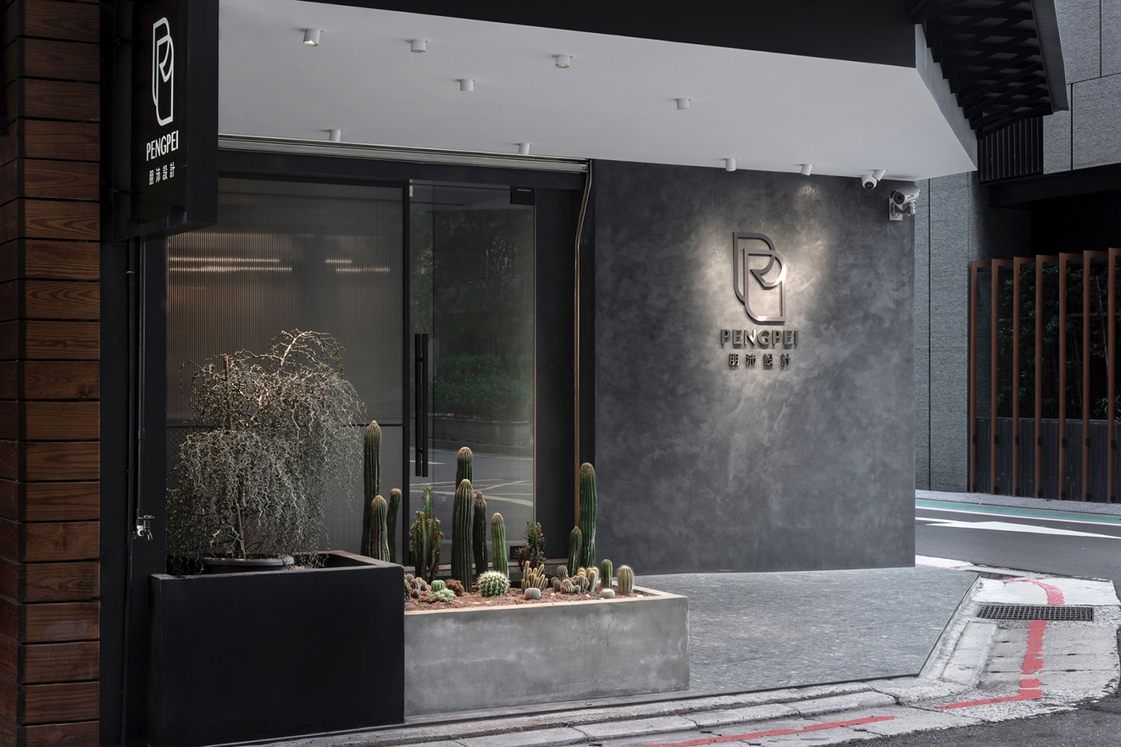
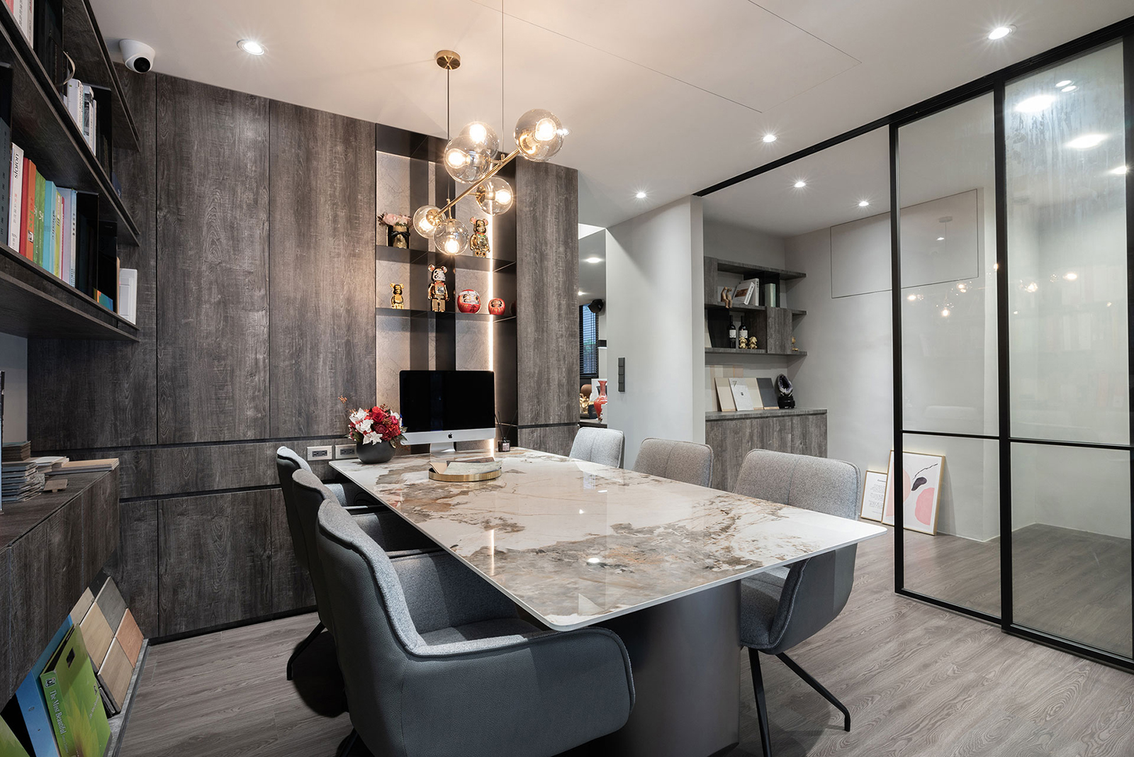
有鑒於臨路角窗的基地位置,灰階局部外牆組織燈光與Logo,成為形象聚焦主視覺,騎樓一角點綴花檯綠植,擔當隱性但友善的劃界象徵。入口連同部分牆線,特地採用數種玻璃材、鋁框拼接,營造質地輕盈、大面通透且層次活潑的光影效果,搭配段落屏風打造玄關、接待區之間的動線轉折與景深變化。接待區兼具建材展示目的,貼牆安排大型層櫃高效分配空間,並利於各種型錄、樣本的收納秩序,而接待區和相鄰會議室之間,另設連軌拉門彈性區隔,確保空間可以隨機獨立或二合為一,以滿足不同時段的成員需求。
In light of the location of the corner window, the partial gray color of the exterior wall is affixed with lighting and the company logo to become the main visual focus, and the corner of the shophouse is decorated with floral greenery to serve as a covert but gentle boundary symbol. The entrance and part of the wall boundary line are made of several kinds of glass and aluminum frames to create a light, transparent and lively light and shadow effect. This is then paired with the sectional partition to create a transition line and apt depth of view between the entryway foyer and reception area. The reception area also serves the purpose of displaying building materials, and large cabinets are arranged against the wall to efficiently allocate space and facilitate the storage of various catalogues and samples. Between the reception area and the adjacent meeting room, there is another flexible partition with sliding doors to ensure that the space can be flexibly independent or combined into one to meet the needs of members at different times.
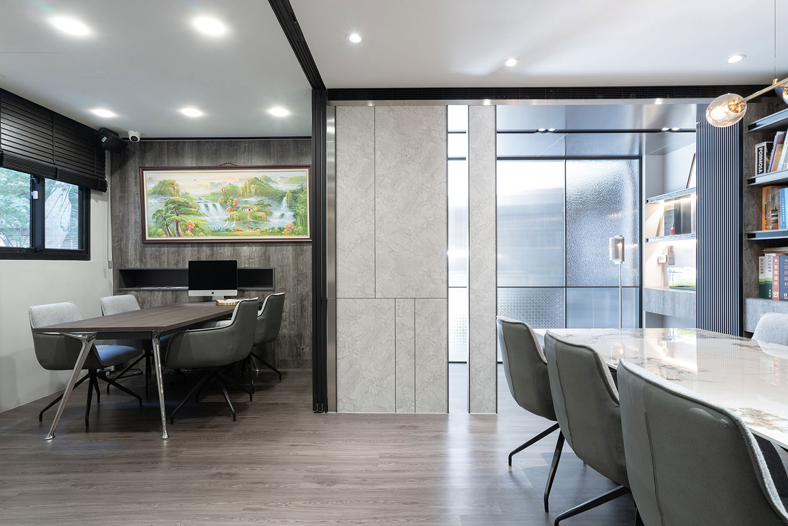
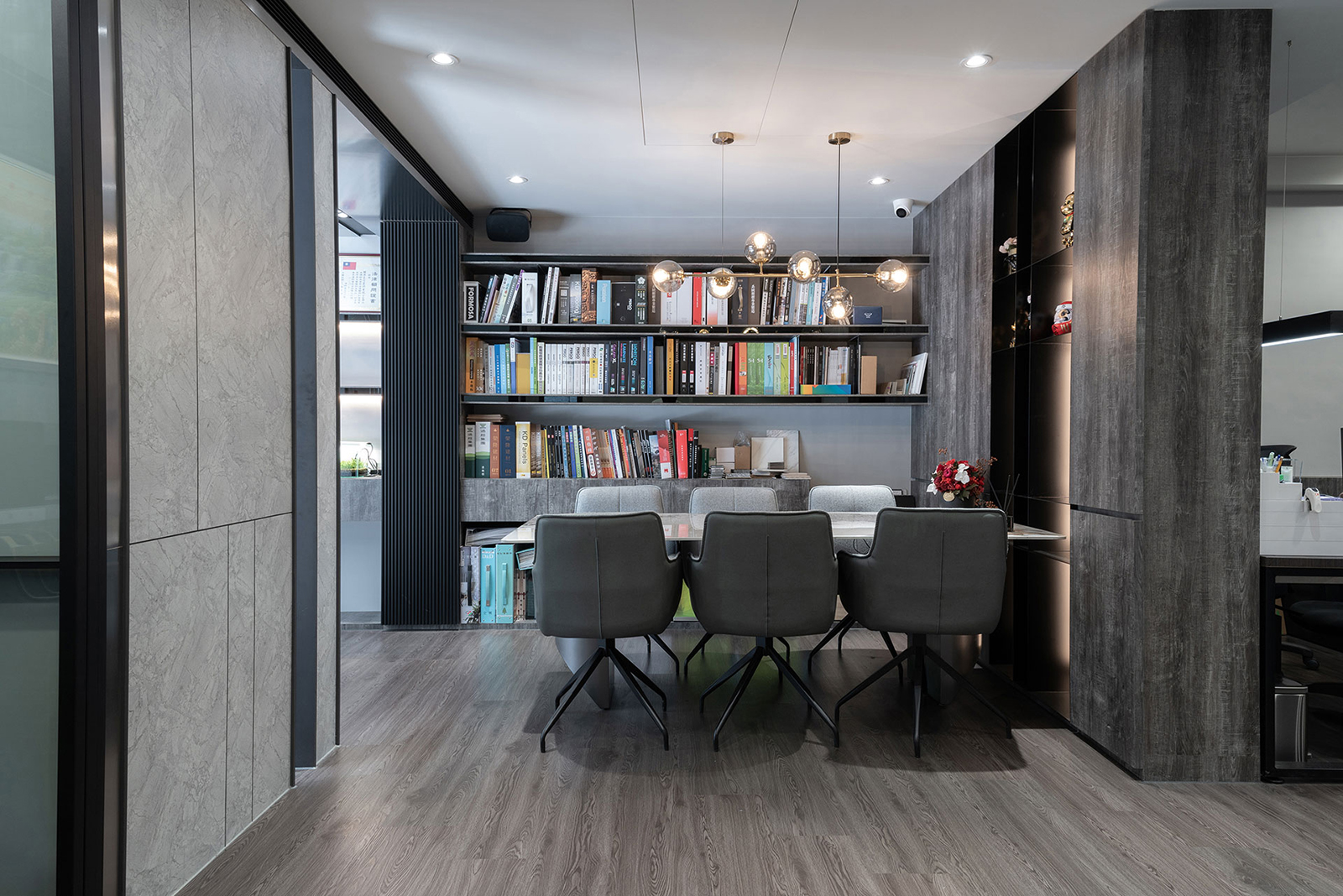

此外,位於最裡側的廁間也是一大亮點,將大型半圓鏡與洗手檯前後疊合,鏡後氤氳打燈以釋放輕鬆的療癒成分,側向安置的龍頭路徑也相當別緻,整體俐落構圖展現設計高度。
In addition, the restroom on the innermost side is also a key highlight; it features a large semi-circular mirror overlapping the front and back of the sink, and a light behind the mirror to exude a relaxing and therapeutic ambience. The laterally placed water tap is also very exquisite, and the overall streamlined design language embodies the breadth and taste of the masterful design.
完整室內設計作品
- 資料來源:
- DECO TV編輯部
- 照片來源:
- 朋沛室內設計