諧蘊 Harmonious Tone|朋沛設計
日期:2022-05-24
諧蘊 Harmonious Tone
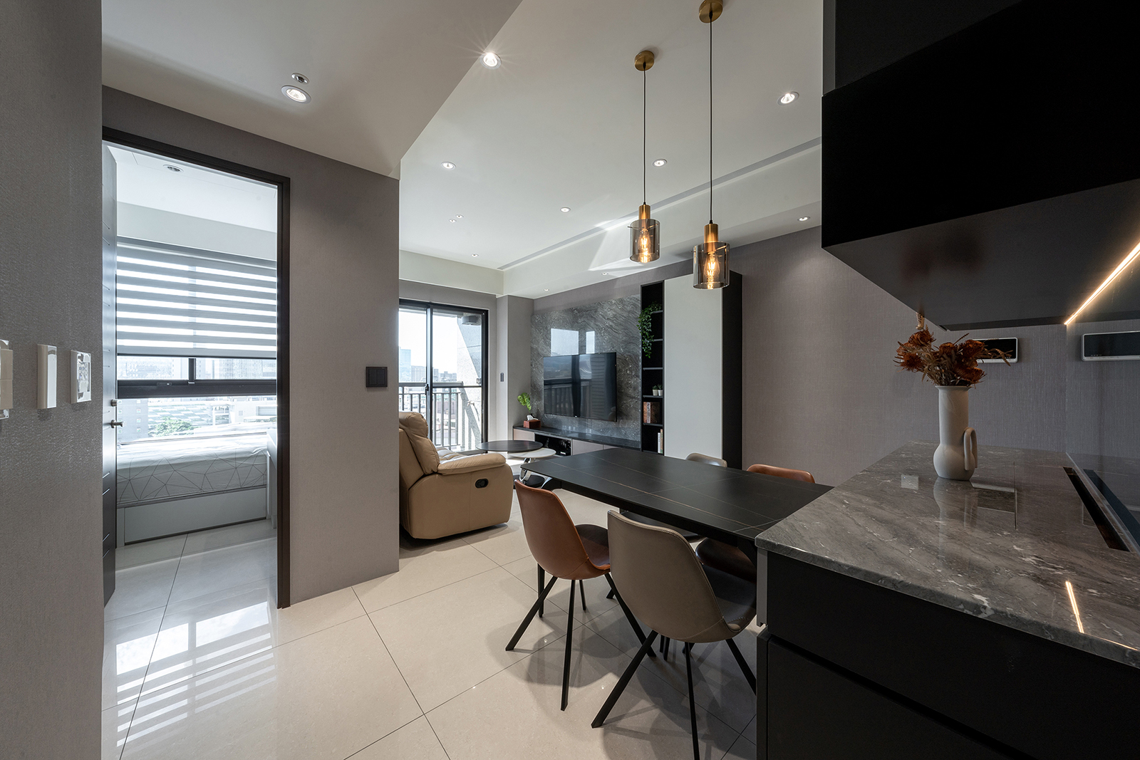
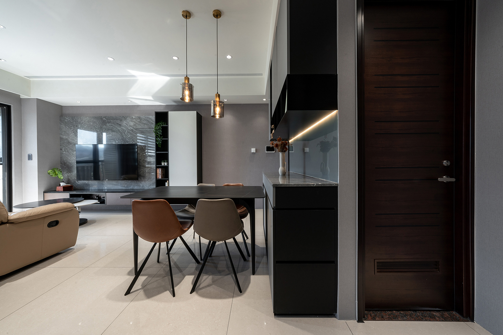
本案為單層住宅規劃,實際室內面積約70平方米,內置兩廳、三房、一廚雙衛為主要機能分區。
This project is the plan for a single-story residence; the actual indoor area is about 70m2 with a dining room, a living room, three rooms, a kitchen and two bathrooms for the main functional portioning.
為了爭取最佳化的使用者利益:首先移除部分牆線、結合精準比例分配來放大空間、削弱封閉感,並創造涵蓋大量收納在內的高坪效;其次是善用玻璃類輕介質取代實牆,強化視覺與光影流動,再搭配全區低限、無壓兼具質感的灰階設定,讓主要設計元素得以前後呼應。
To accomplish the optimal user benefits, part of the wall lines was removed. Together with the combination of accurate proportion arrangement, this is meant to enlarge the space, weaken the sense of closure and create the high sales per square meter containing a large amount of storage. Secondly, light-medium such as glass is used to replace the physical walls, reinforcing visual sensation and the flow of lights and shadows. The quality gray-tone setting with low restriction and zero stress was further applied to allow for correspondence between the design elements.
玄關地坪選用特殊木紋磚拼貼,帶出活潑與明確的內外分界,左側高櫃至正面端景櫃,結合精緻線性分割與連續面整合,同步完成收納、展示與柱體、電錶箱的修飾。客、餐廳採共享景深的開放設定,米白、深淺灰階共構的場域色溫,自然而然型塑溫馨且放鬆的情境包容力。私領域亦延續簡約現代風格,其中主臥床頭採用棗褐紅乳膠皮革細膩平繃,搭配地面木地板暖調紋理,彰顯個性鮮明、沈穩安定主視覺。孩房則是清淺佈色,閱讀桌面和床頭銜接處,特意收圓以避開危險銳角,細節處的巧思格外熨貼人心。
The selected foyer flooring is a unique collage of wooden tiles to bring out the lively and distinctive boundary between the interior and the exterior; the high cabinet on the left and the end cabinet combined exquisite linear segmentation and integration of continuous surfaces, thereby simultaneously achieving storage, display, column volume and the decoration of the electricity meter box. The living room and dining room adopted the open setting of shared depth of field, where the common venue color tones of cream, dark and light gray colors naturally sculpted the cozy yet relaxing scenario and tolerance. The private space also continues with the simple modern style, amongst which the bedhead in the master bedroom has adopted a board wrapped with maroon casting leather, accentuating distinct personality and stabilizing the main visual sensation together with the warm tone of the wooden flooring. The kids’ rooms are in light colors, where the connection between the reading desktop and the bedhead especially applied rounded corners to avoid dangerous sharp corners, demonstrating particular thoughtfulness via ingenious details.


完整室內設計作品
- 資料來源:
- DECO TV編輯部
- 照片來源:
- 朋沛室內設計