淨沐韶光 Pure Bliss|參拾柒號設計
日期:2022-05-10
淨沐韶光 Pure Bliss
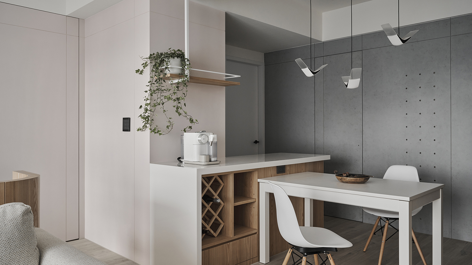
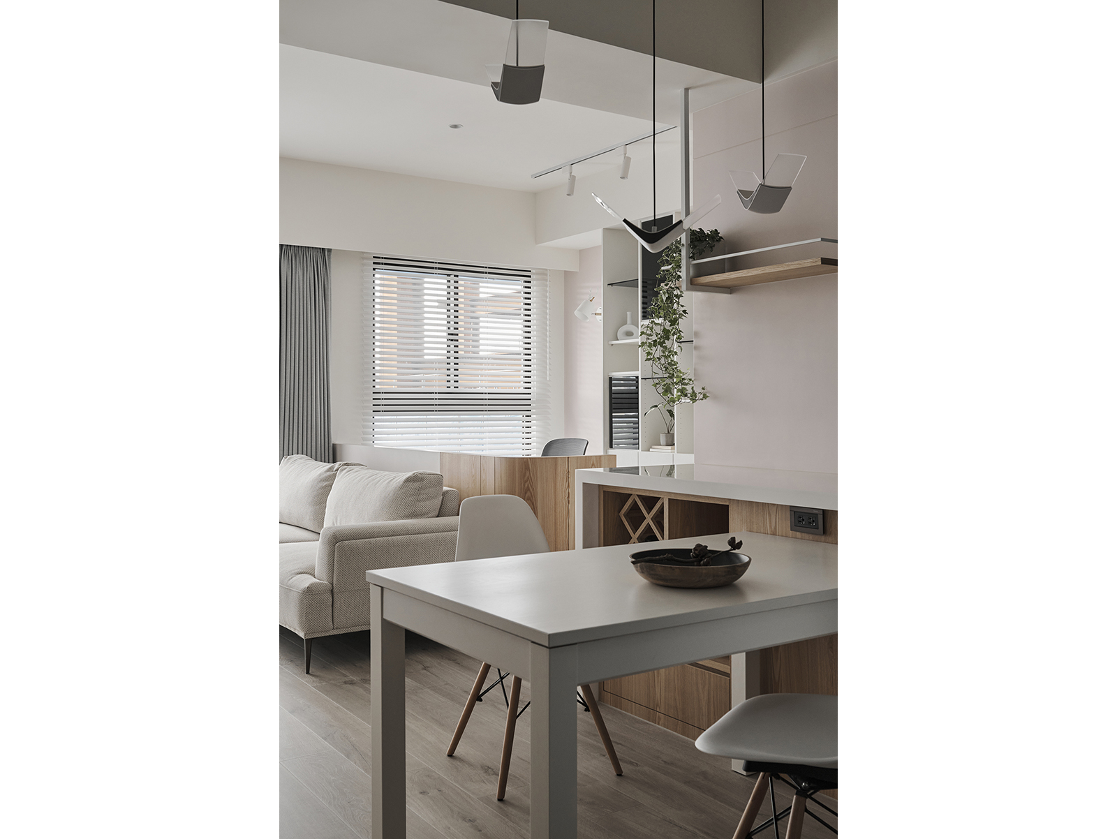
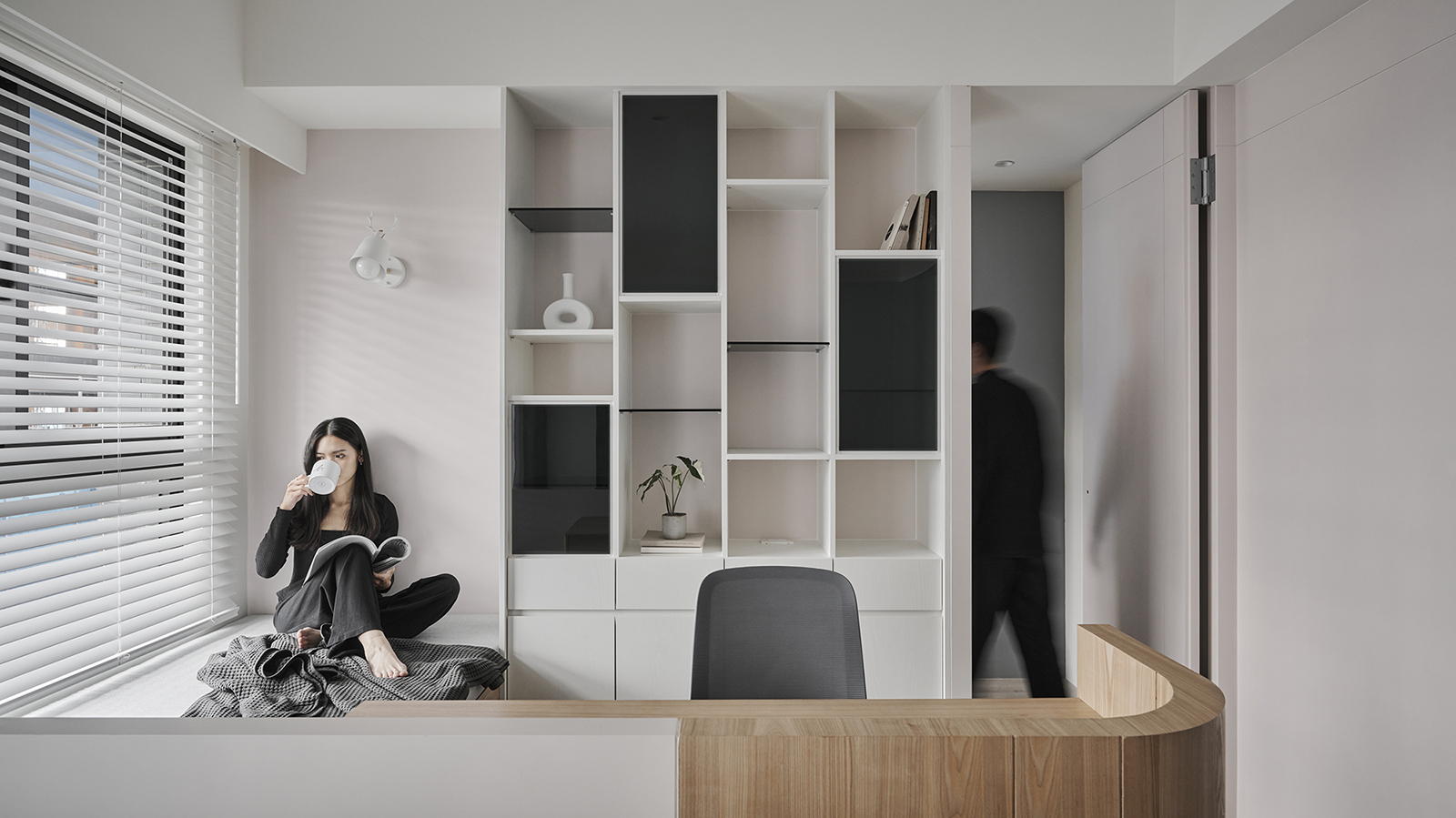
本案為新成屋,客變階段即接手規劃,第一步先善用屋型方正、採光好的先天優勢,打造包含玄關、客、餐廚、開放式多功能書房在內,互動性、合理性和流動感兼顧的公領域軸線,第二步再藉由精準局部牆線規整,結合附加酒架、收納等機能的特製中島,積極優化餐廚合併後的工作動線、情境氛圍與使用者體驗。另一個改造重點落在變更門向後,順帶放大使用範疇的主浴室,設計細節在於調整私動線、升級四件式洗浴設備,一圓屋主對私密場域的浪漫期待。
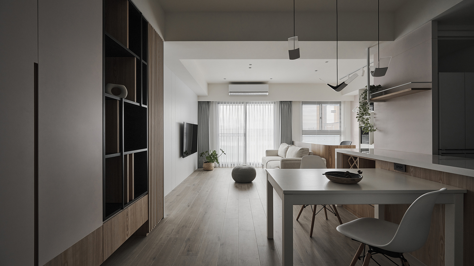
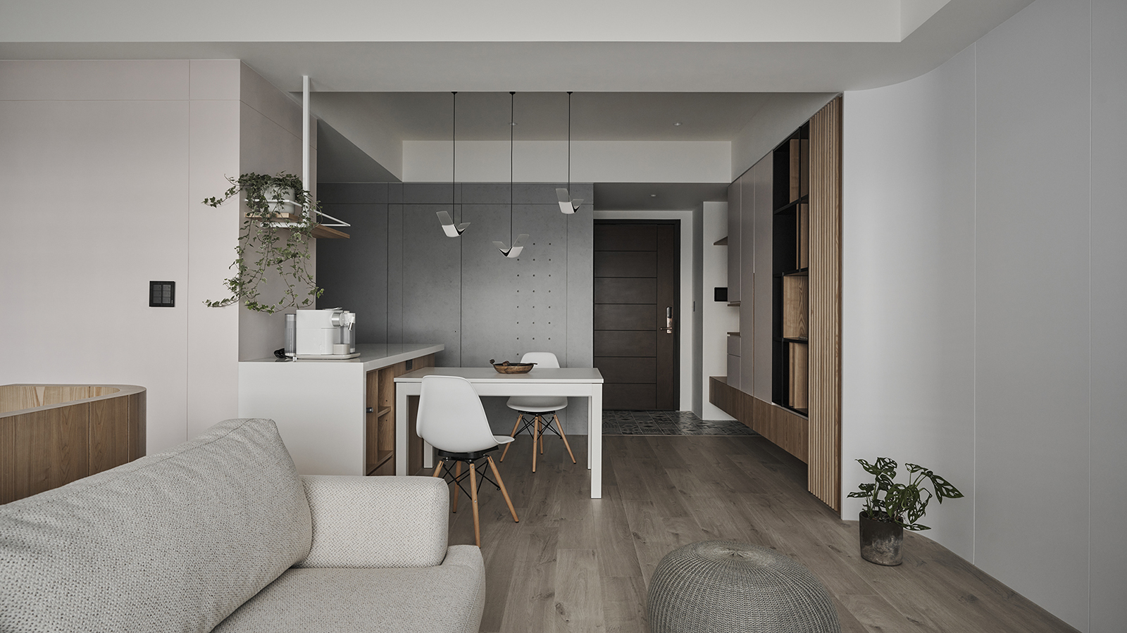
This project involves a newly completed residential development, with the project team commissioned at the beginning of the customer change phase. The first step was to take advantage of the square layout and generous natural lighting to create a public area axis that includes the entryway foyer, living room, dining kitchen and an open multi-functional study, with a keen sense of interaction, practicality and flow. The second step was to optimize the flow, ambience and user experience of the combined kitchen and dining room by precisely aligning partial wall lines and combining them with a custom-made kitchen island with additional wine shelves and storage. Another key focus is to alter the direction of the door, which in turn enlarges the area of use of the master bathroom. The design details include adjusting the flow and upgrading the four-piece bathing facilities to fulfill the homeowners romantic expectation of a private and intimate place.
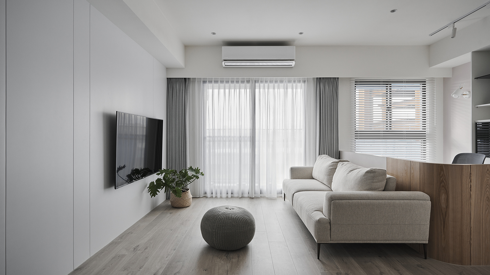
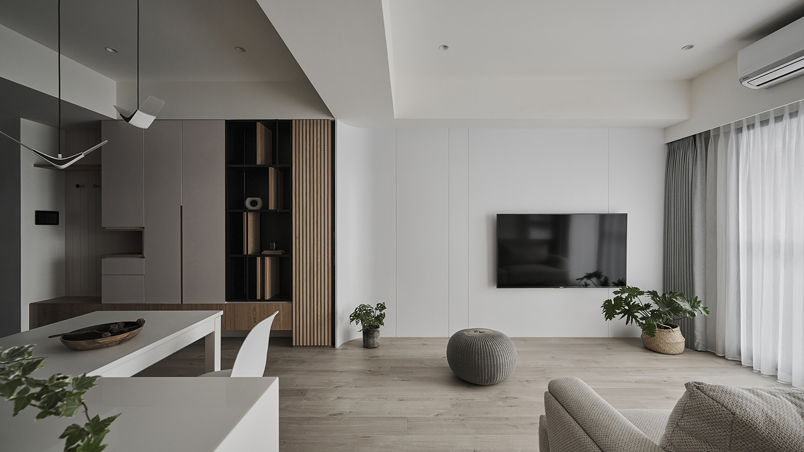
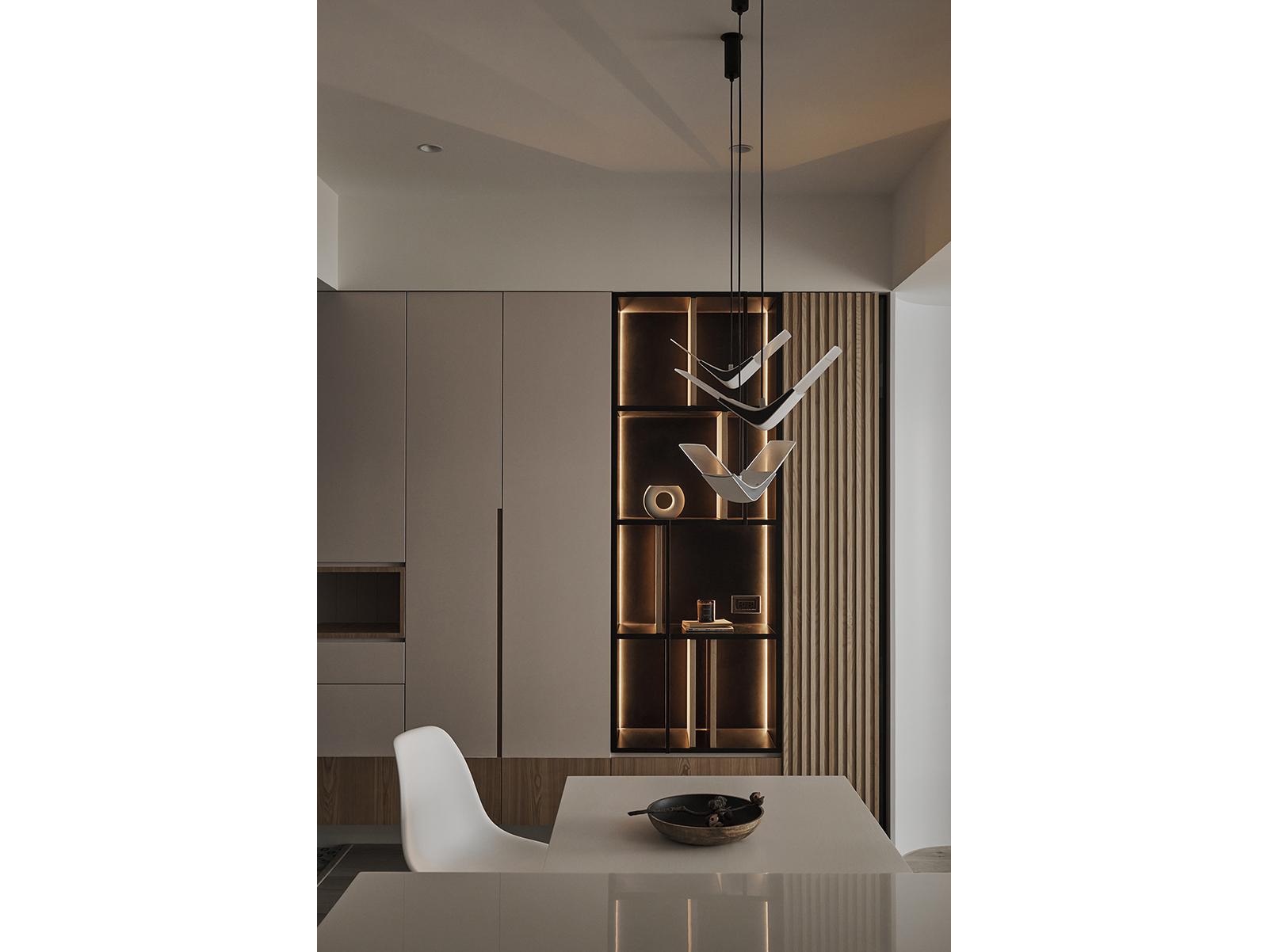
儘管室內實際面積僅63平方米,但整體開放構圖,加上米白、暖灰、木質系為主的清淺色溫,無形中數倍放大既視感。櫃體、立面造型盡可能減少落塵面,例如客廳電視牆的極簡處理,將相關視聽設備整合於左側格柵高櫃內,大幅省去清理養護的時間、體力,瀰漫空氣中隱含輕美式風情的現代北歐況味,清新內斂且深度有味,適度留白也給未來增減預留彈性。另外在餐燈、餐區背光端景櫃、玄關旁客浴入口的連續面整合,以及多功能區作為公領域遠端景的書格櫃、窗邊臥榻、主臥室床頭灰藍與米白斜切的主題色等等,都為這生活場域,憑添豐富情節和設計亮點。
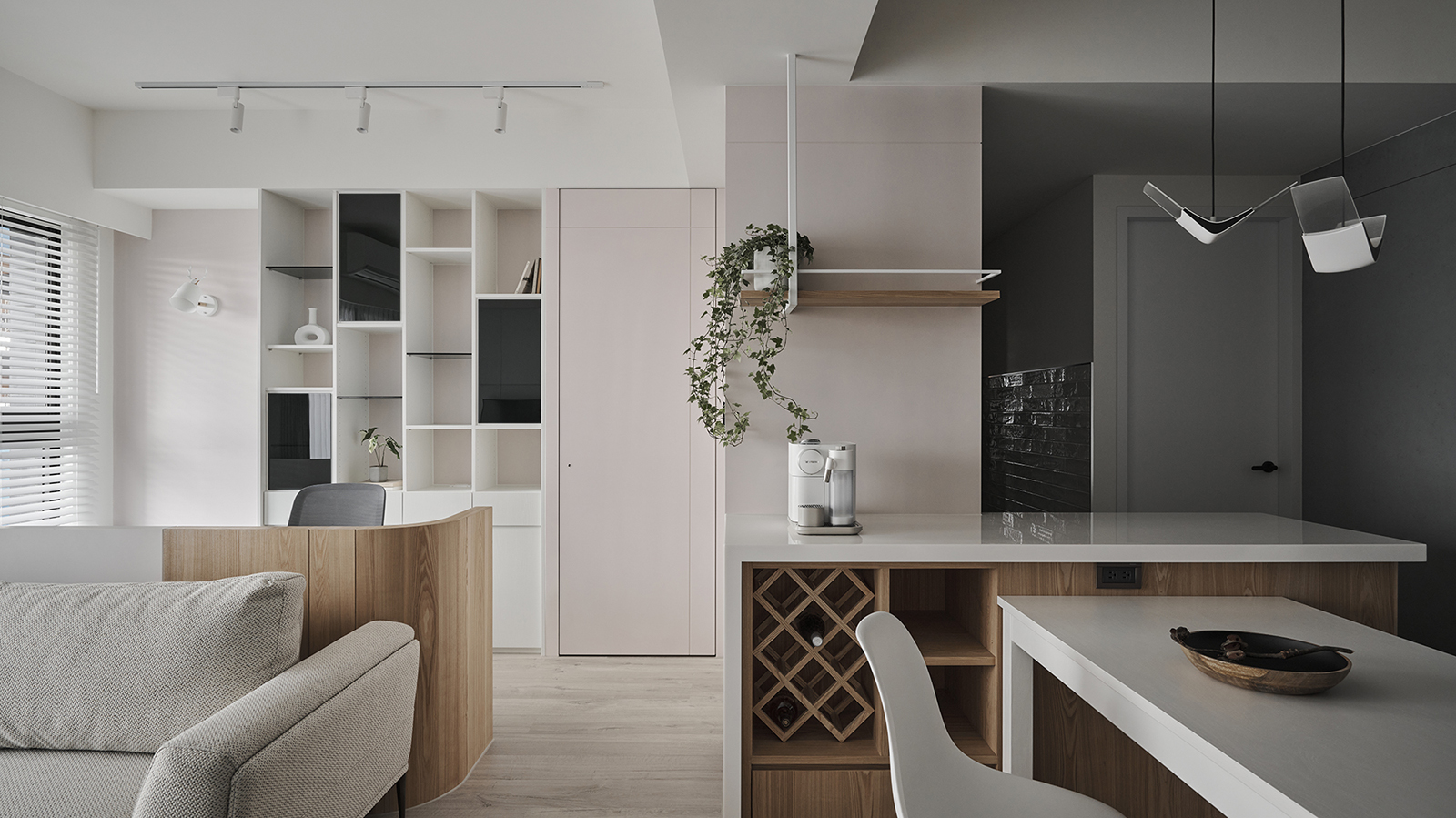
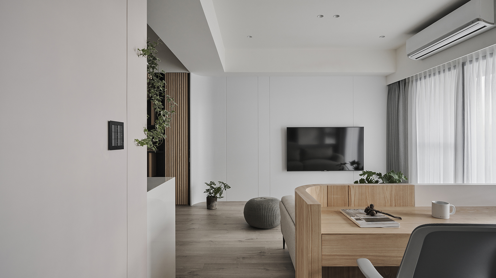
Although the actual usable area of the interior space is only 63 square meters, the overall open layout and the light colors of beige, warm gray, and wood chosen as the main interior color temperature serve to magnify the sense of space. The cabinets and facade shapes are aimed at reducing dust-gathering surfaces as much as possible. For example, the minimalist design of the TV wall in the living room integrates the related audio-visual equipment with the high cabinet on the left side of the grille, which greatly saves the time and physical effort of cleaning and maintenance, and impresses with a contemporary Scandinavian design flair and American elements. It is a refreshing and understated design with depth and taste and a moderate amount of blank space is intentionally reserved for future flexibility. In addition, the lighting and backlit end cabinet in the dining area, the continuous surface integration of the entrance to the guest bathroom next to the entryway foyer, the bookcase in the multi-functional area that serves as a backdrop to the public area, the window-side bedroom couch and the gray-blue and beige slanting theme color of the master bedroom headboard, etc. all add an extra layer of richness and design highlights to this living area.
完整室內設計作品
- 資料來源:
- DECO TV編輯部
- 照片來源:
- 參拾柒號設計