寓逸 The cozy home|瓦匠設計
日期:2022-04-06
寓逸 The cozy home
本案為集合大樓單層住宅,有鑒於三房原格局還算符合屋主階段性需求,因此在開放規劃的公領域之外,另進行主臥室、小孩房及書房暨更衣室、廚房、兩衛浴等獨立單元配置。
This case is a single-story residence in congregate housing. The original three-bedroom layout was still in line with the owner-phased needs. Except for planning the open public areas, so we made the disposition of separate units such as the master bedroom, childrens bedroom, and study combining dressing room, as well as kitchen and two bathrooms.
包含進門玄關區在內的公共場域,大範圍採用質樸溫馨的大地色系,為空間、機能櫃體打底,像是擁有斑駁肌理與手作溫度的灰階清水膜塗料、偏深木質材、施作客廳電視牆主立面的倣石紋美耐版等等,調和兼具無壓、療癒與官能舒適性的居宅氛圍。
In the public field, including the entryway area, we used a wide range of simple rustic and warm earth color systems to lay the foundation for space and functional cabinets. They are like to have a gray-scale clear water film coating with mottled texture and hand-made temperature. Its deep wood and the stone-like beauty resistant plate applied to the main facade of the TV wall in the living room reconcile a residential atmosphere with pressure-free, healing, and functional comfort.
由玄關鏡牆往客廳延伸的長牆面,為公領域整合收納的重要區塊,設計者結合俐落線構、優質系統板材、黑白雙色對比和局部進退差設計,打造兼具實用性與現代美感的大型綜合量體,並與左側背光電視牆的類石紋、下緣線性低檯相呼應,整體過濾不必要的裝飾性,掌握悅目合宜的絕佳比例,進而完善簡約、低限、人性化為主軸的現代風格。
The long wall extending from the entryway mirror wall to the living room is a significant block for the integration and storage of the public domain. Designers combined neat line structure, high-quality system plate, black-and-white two-color contrast, and local advance and retreat difference design to create an extensive comprehensive volume with practicability and modern beauty. It echoes with the stone-like pattern of the left backlight TV wall and the lower edge linear low platform. On the whole, we filtered unnecessary decoration, master the excellent proportion of pleasing to the eye, and then improve the modern style with simplicity, low limit, and humanization as the primary axis.
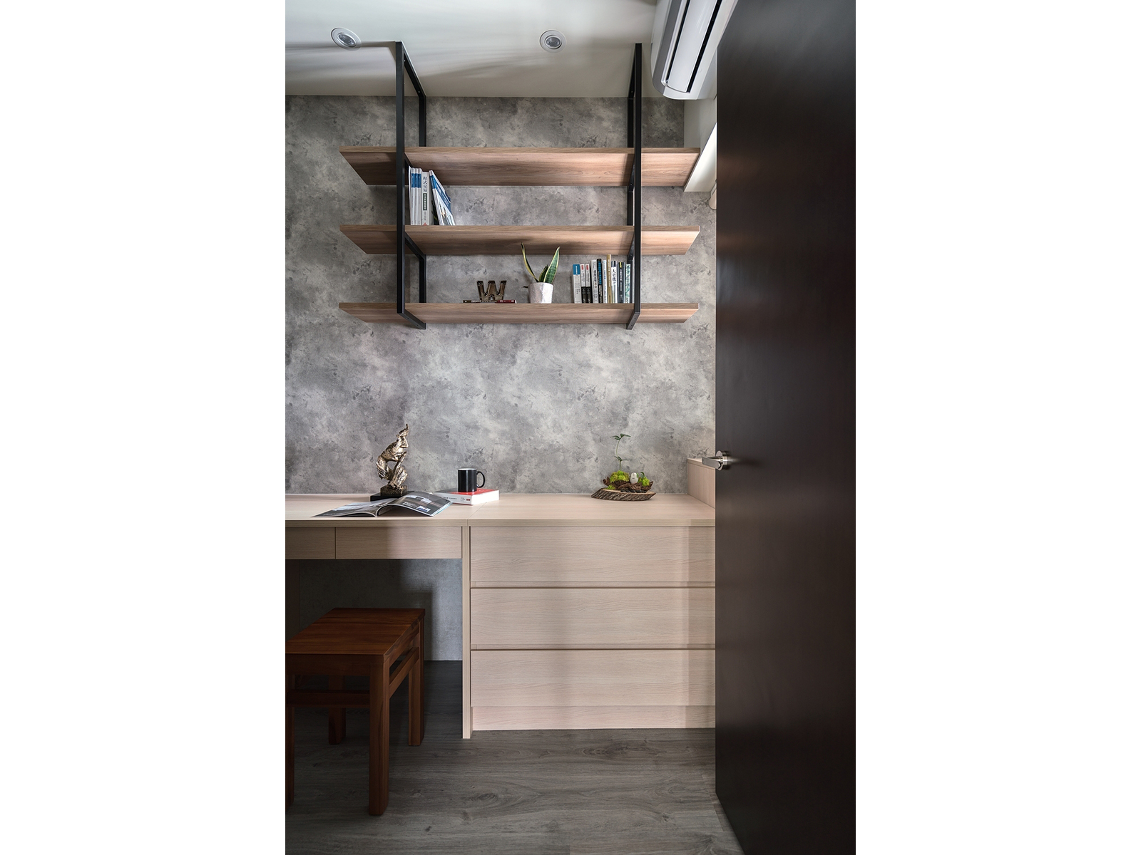
單一空間多功能設定,為本案放大空間尺度、增加生活樂趣的積極手法之一,其中由一房改造的更衣室暨書房最具代表性:首先沿牆設置L型開架式櫃體,櫃體內裝搭配金屬拉籃、橫桿、拉抽、可動格層架、燈帶照明等分區機能組合,讓四季衣物、飾品、皮件、其他生活器物都能井然有序、一目暸然,創造有限空間內的最大實用收納效益。房內由櫃體延伸而出的閱讀長檯同樣貼牆安置,檯上、下牆面選用與公領域牆面圖紋類似的壁紙施作,除了易於日常清理、修繕或後續更換,也延襲內外呼應的簡潔設計風格。
Single space multi-function setting was one of our positive methods to enlarge the space scale and increase the fun of life. Among them, the dressing room combining study transformed from one room was the most representative. First, we set an L-shaped open shelf cabinet along the wall. The cabinet has equipped with a combination of zoning functions such as a metal pull basket, crossbar, pull-drawer, movable grid shelf, and lamp belt lighting. Therefore, the four-season clothes, accessories, leather goods, and other living utensils can be orderly and stick out a mile, creating the maximum practical storage benefit in a limited space. We also placed the long-sized reading table extending from the cabinet in the room close to the wall. The table surface and the below wall, choosing to paste wallpaper similar to the wall pattern in the public domain. In addition to being easy to clean, repair, or subsequent replacement, it also inherits the concise design style echoed inside and outside.

全案選材用料考慮耐候性、美觀、健康無毒與易養護,例如公領域大範圍塗裝的暖灰清水模塗料,具備美觀、純淨無異味、可修補等優點,硬體方面則取傳統木作的細緻搭配高效率系統櫃,此外,主臥室床頭精美的寶藍色軟繃工藝,亦屬為私情調增色的亮點之一。
We have selected the materials used in the whole case in considering the weather resistance, beauty, health, non-toxicity, and easy maintenance. For example, the warm gray and architectural concrete coatings that we applied on a large scale in the public domain are beautiful, pure and odorless, and repairable. In terms of hardware, we adopted the meticulous collocation of high-efficiency system cabinets made of traditional wood. In addition, the exquisite royal blue soft stretch craftsmanship at the headboard of the master bedroom is also one of the highlights that adds to the private sentiment.
- 資料來源:
- DECO TV編輯部
- 照片來源:
- 瓦匠空間設計