醇夢|沐易設計
日期:2021-12-21
醇夢 Open your wings to find your dream coffee shop
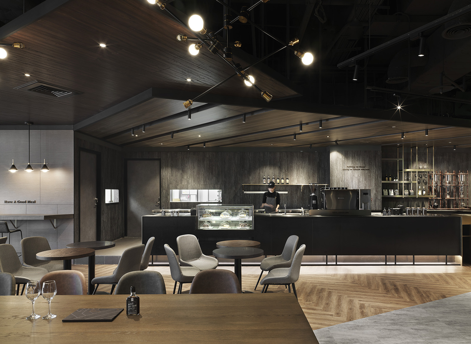
本案座落百貨商場五樓,室內約270平方米,呈L型的基地雖不夠方正,但勝在一覽101大樓地標與精華街景的連續廣角窗優勢,因此,規劃上優先考量最佳客容數,並在極短工期內克服所有實作與法規面挑戰,逐一打造流暢動線、靈活客座聚落,以及足以優化品牌形象的空間風格。
The case locates on the fifth floor of the department store, with an indoor area of about 270 square meters. Although the L-shaped base is not square-shaped enough, its advantage lies in the continuous wide-angle window that can see the landmark of building 101 and the essence of street view. Therefore, we gave priority to the maximum customer quantity in planning and overcome all implementation and legal aspects challenges in a very brief time. Create a smooth moving line, flexible guest settlement one by one, and a space style sufficient to optimize the brand image.
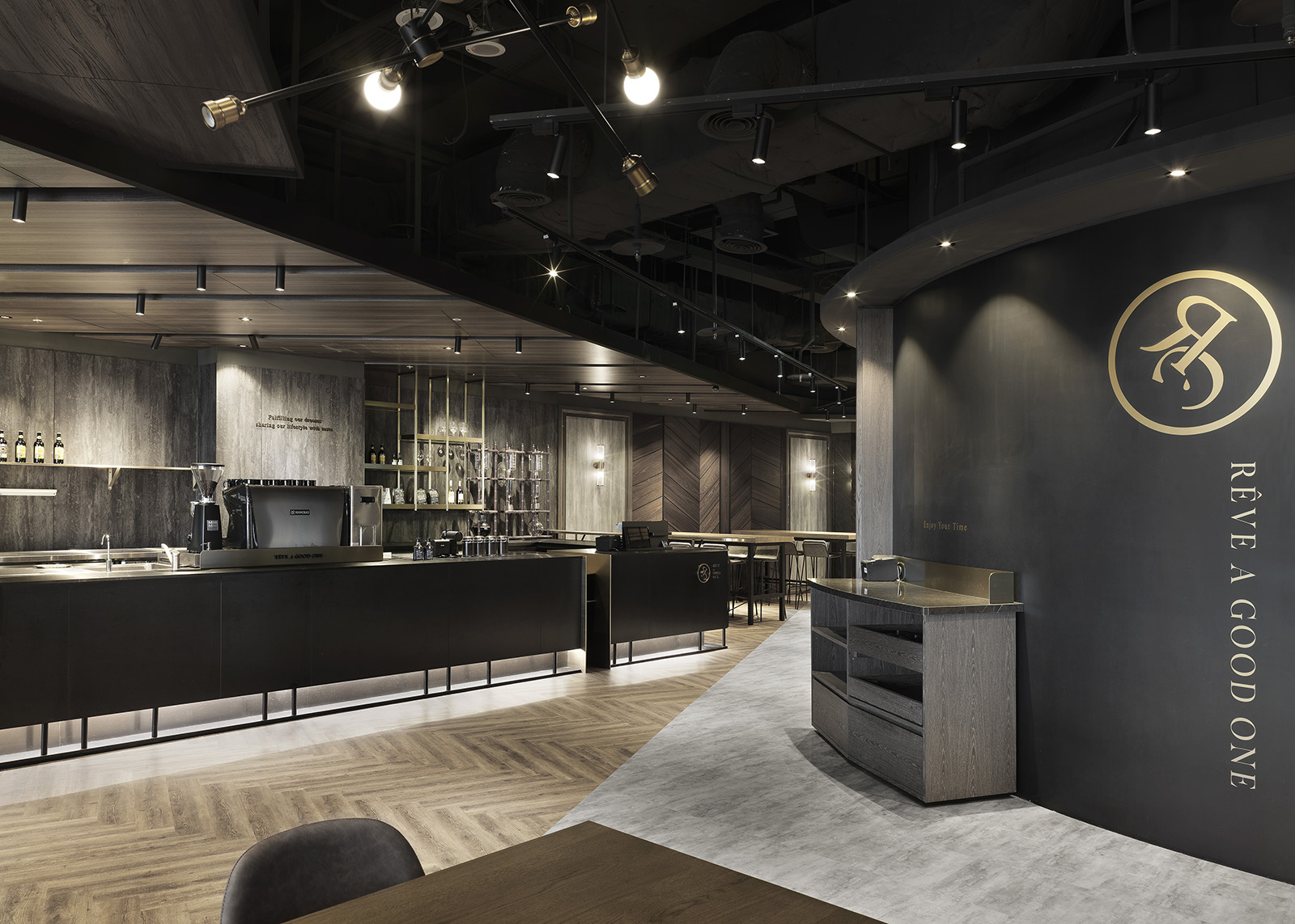
作為品牌北上插旗首發作,既要承襲舊有黑系工業調性,還需對應該地段主流的年輕商務族群喜好,雙方經多次討論後,決定結合黑金色調、精工施作與特色素材,醞釀兼具時尚與都會低奢的場域氛圍。
As the first store for the brand inserting a flag in northern Taiwan, it should not only inherit the original black industrial tone but also correspond to the preferences of the mainstream young business community in the location. Therefore, after many discussions, the two sides decided to combine black-gold color, elaborating work, and characteristic materials to brewing a realm atmosphere with both fashion and low luxury of the city.
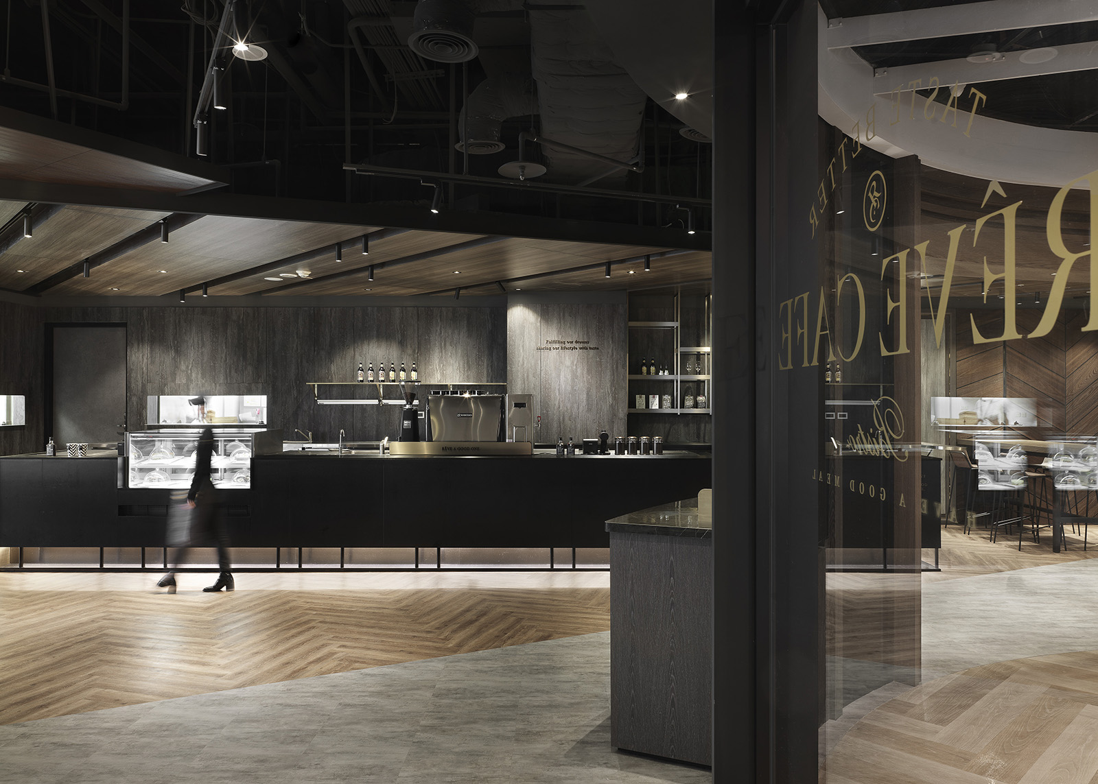
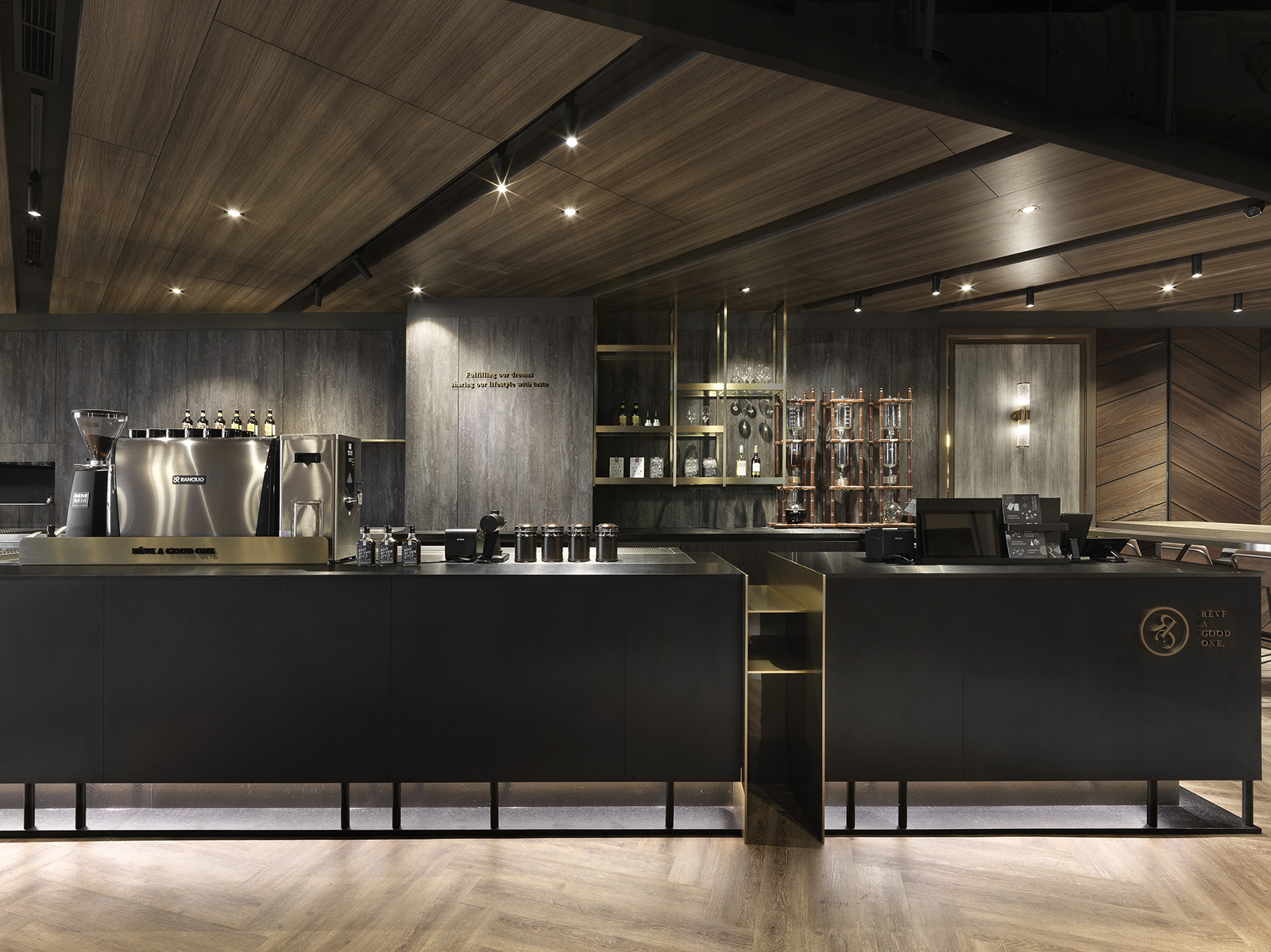
入口視角順著外走廊開揚弧度,加上隔間大量採用玻璃材,倍顯店內光影層次、人員活潑動態與明亮感。店內避免硬性切割,讓不同來客組合都能舒適用餐,並將基地先天特有優勢極限發揮。全案主要設計靈感取自「逐夢展翼」概念,透過精算比例的幾何板塊切割、串接、堆疊,形塑空間三維向量間黏稠的力道和想像,選料石材、木質、鐵件三者為主旋律,穿插深淺有致的星光照明,使其各表姿態卻又能水乳交融,細膩醇厚的空間底蘊如同一杯上好咖啡,香氣與情境同樣令人上癮。
The entrance angle of view is along with the open arc of the outer corridor. And we used many glass materials in the compartments, which doubles the display of light and shadow in the store and the lively dynamic and bright sense of personnel. Avoid tough cuts in the store so that different combinations of visitors can eat comfortably and maximize the inherent advantages of the base. The primary design inspiration of the whole project derived from the concept of "Open up your wings to find your dream." Through the cutting, concatenation, and stacking of geometric plates of actuarial proportions, we shaped the viscous force and imagination among the three-dimensional vectors of the space. The choice of materials, stone, wood, and irons is the central melody, interspersed with deep and shallow starlight illumination that the appearance of each table has its posture that can also blend in harmony. The delicate and mellow space background is like a good cup of coffee, and its aroma and situation are as addictive.


- 資料來源:
- DECO雜誌
- 照片來源:
- 沐易設計